SECOND THOUGHT – ART DIRECTION
I worked closely with JT Chapman, creator of the “Second Thought” YouTube channel, for many years. I provided the branding, art direction, and visual design that helped grow the channel from its infancy to its turn towards more journalistic content. Second Thought currently has over 1.9 million subscribers on YouTube.
INITIAL BRAND (2016)
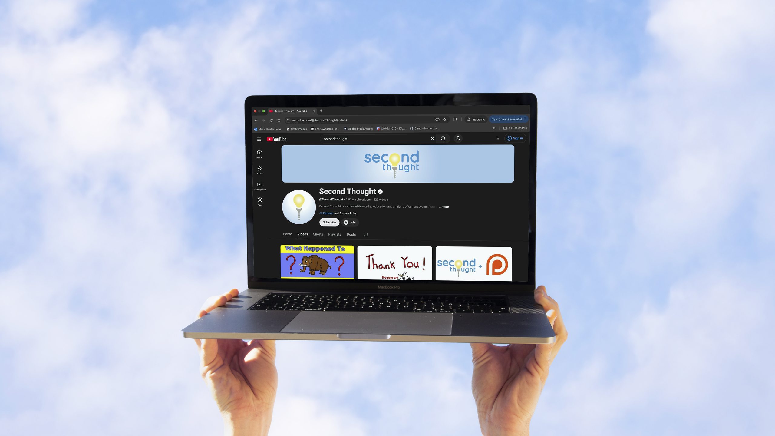
JT originally billed Second Thought as “a channel devoted to the things in life worth thinking about: science, history, politics, religion… basically everything you’re not supposed to talk about at the dinner table!” This mission statement informed the initial logo, motion graphics, and brand identity that I designed for the channel. These featured prominently in the advertising, the social media presence, and of course the intro to every Second Thought video.
Logo – Motion Graphic
In cartoons, the concept of a thought, or an “aha!” moment, has long been visually depicted as a lightbulb. So it made perfect sense to me that a lightbulb should be the Second Thought logo. I chose the typography (Quicksand) to convey a friendly and modern feeling, while the brand’s light blue colors symbolize calm and clear headedness. Together they invoke the feeling of having willingly learned something new, rather than having preconceived notions challenged. This approach was deliberate, and allowed JT to broach sometimes challenging subject matter without galvanizing or upsetting his growing audience.
Logo – Light Off

Logo – Light On
REBRAND (2020)
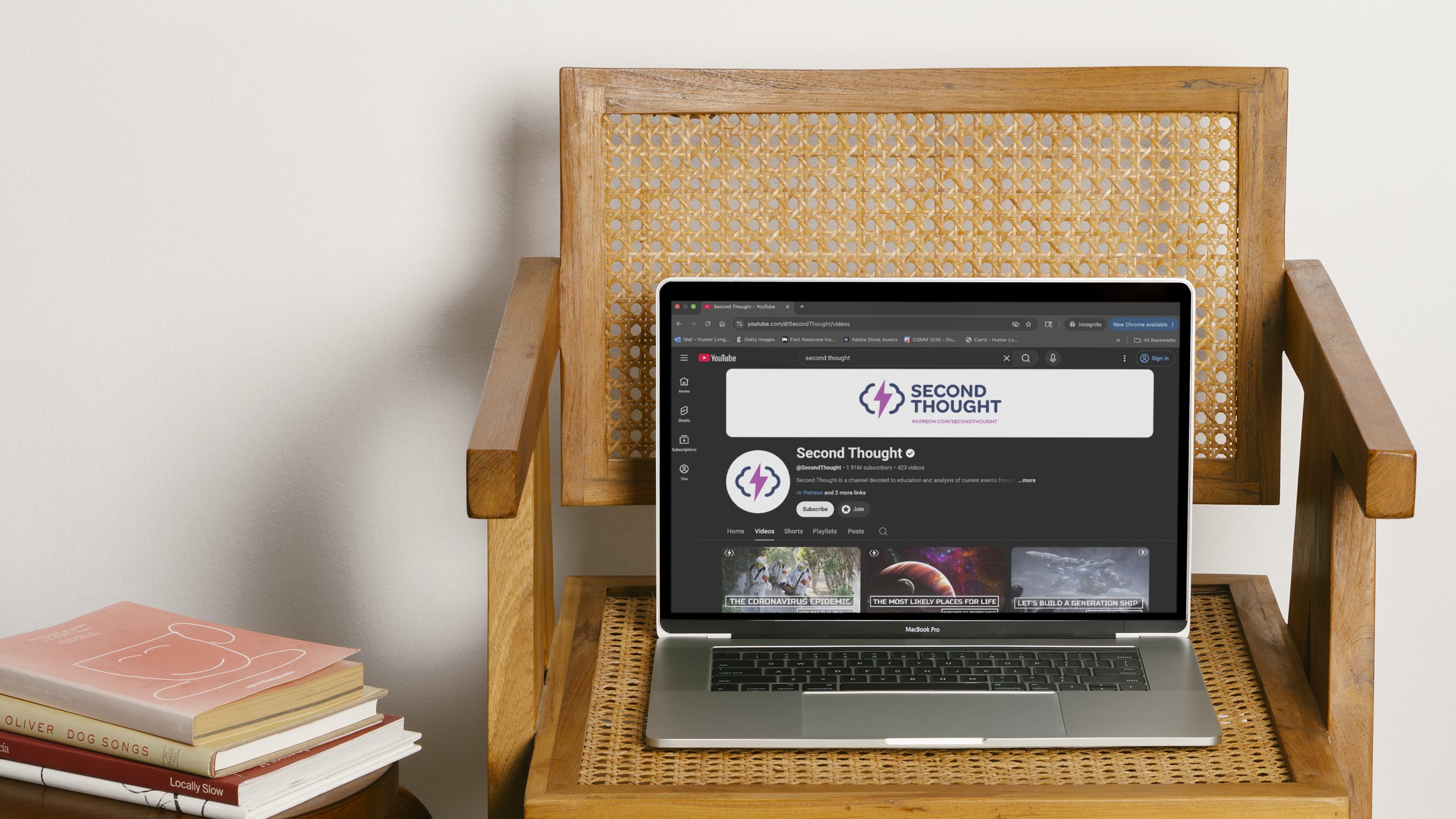
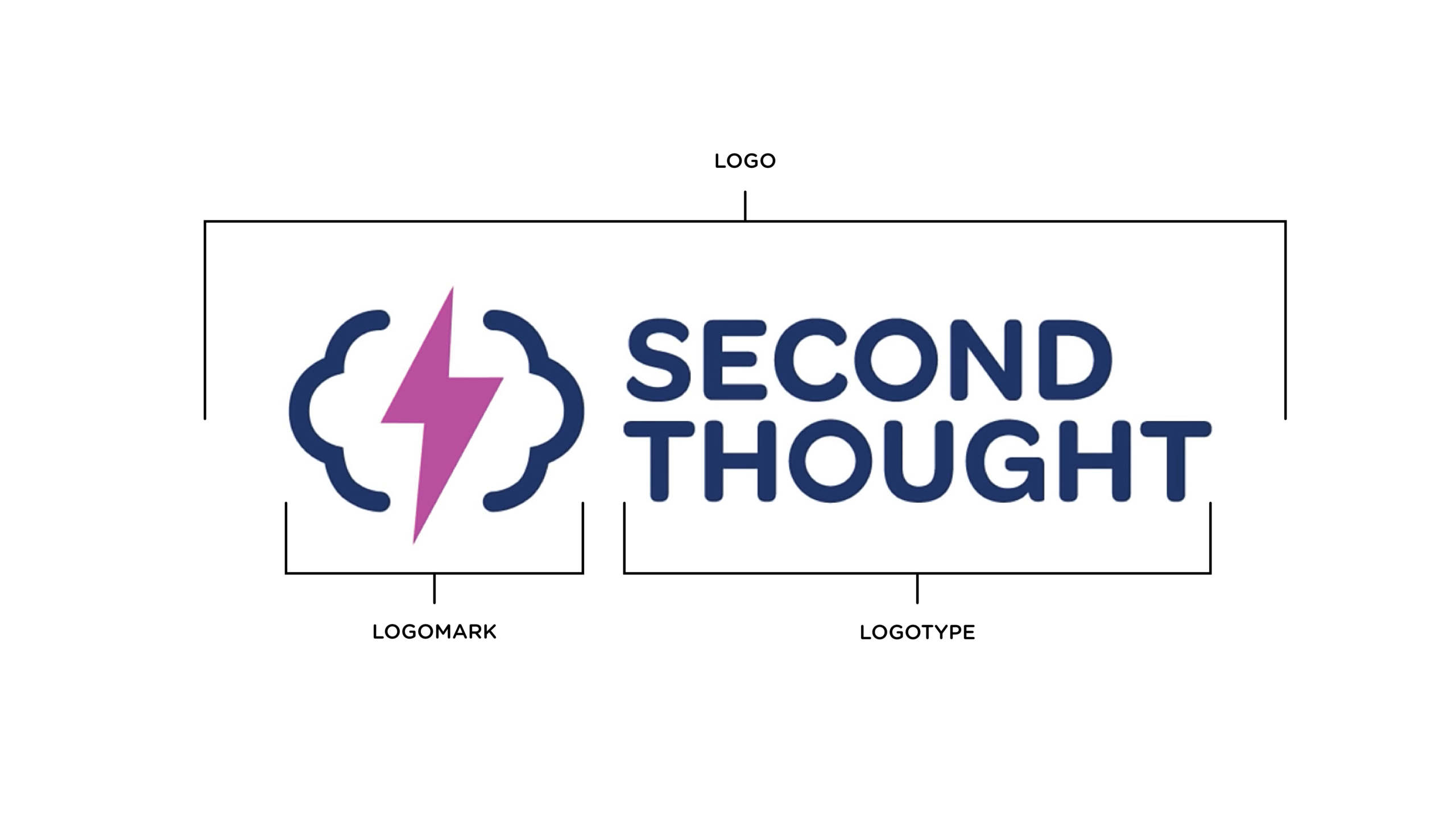
In 2020 JT began shifting his content strategy to focus primarily on journalistic and political topics, so consensus called for a rebrand. My lightbulb logo became a lightning bolt; my lowercase type became all uppercase. The rebrand still symbolizes clear headedness — for the lightening bolt splits between two lines made to resemble both a cloud and a brain — but also conveys that the ideas being shared are now sharper, more forceful, and less afraid of being controversial.
Also, separating the logomark from the logotype was a strategic choice. It allows for the Second Thought brand to still be recognizable in instances where the full logo can’t fit, such as in the YouTube channel’s profile picture and video watermarks.
Poster
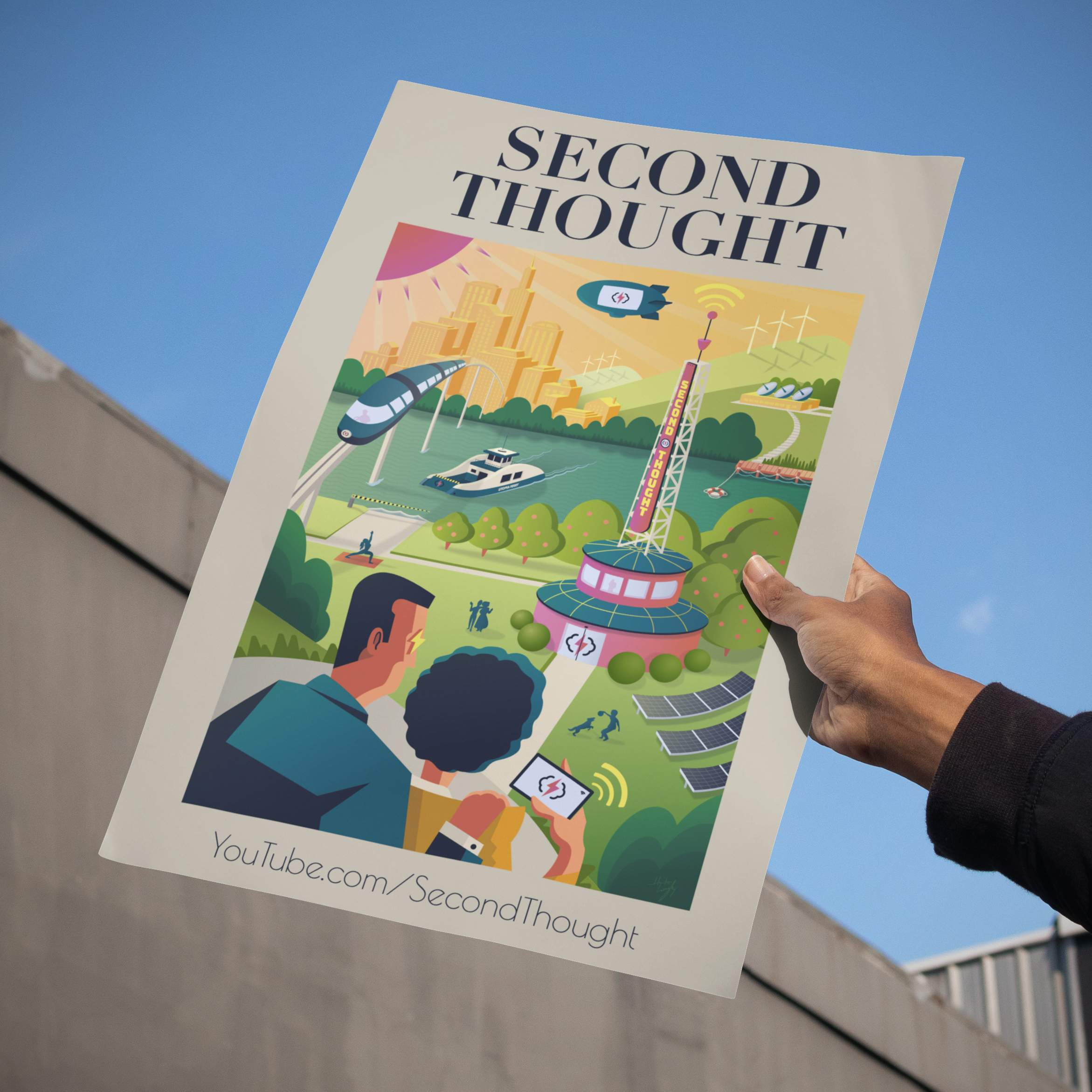
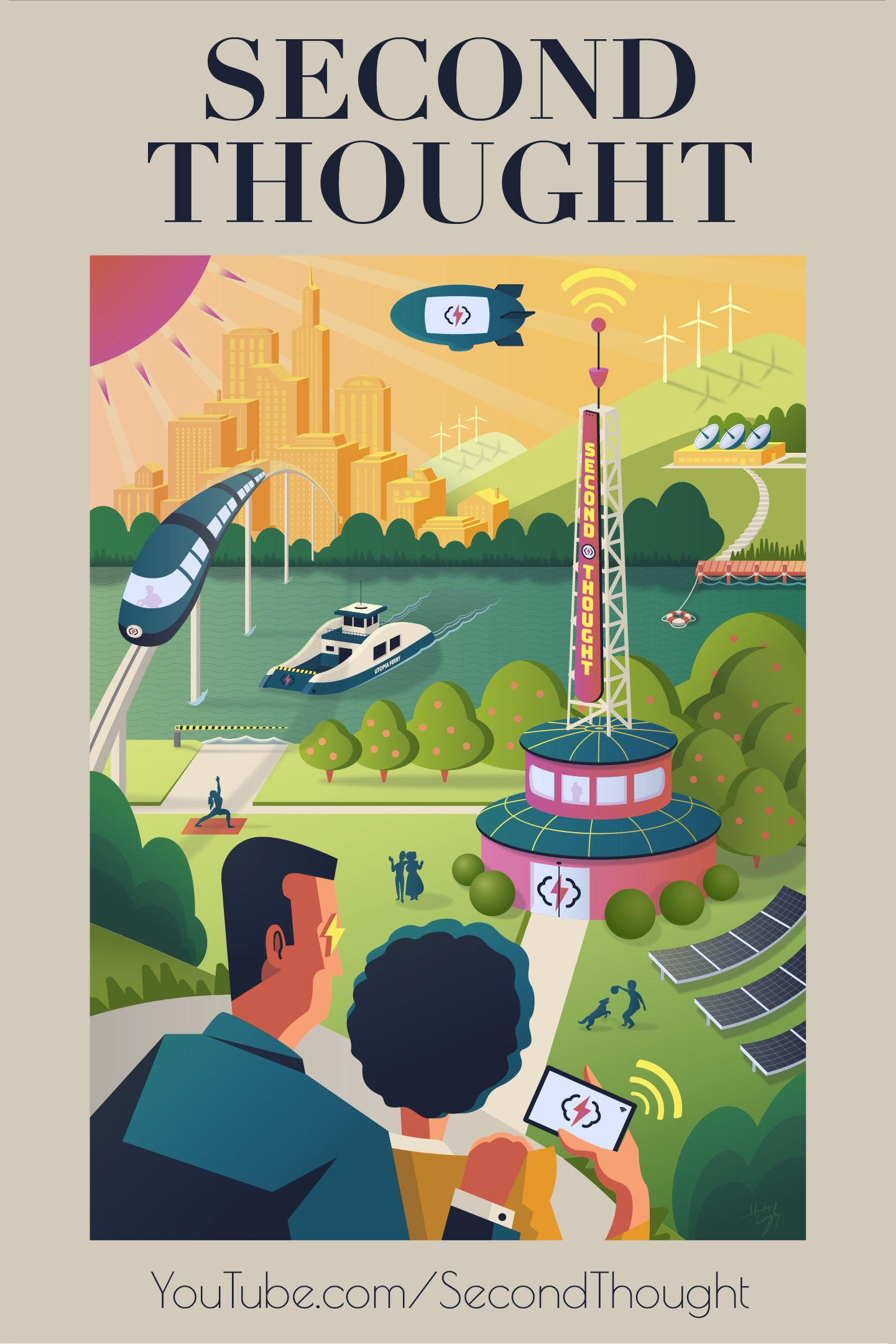
JT then commissioned me to design a stylish poster for the Second Thought channel, suitable for print, apparel, and parallaxing webpage backgrounds. Given JT’s growing bent towards FDR era politics, I took inspiration from the Federal Art Project of 1935, world’s fair posters, mid-century Harper’s Magazine covers, and the Green New Deal poster series that had recently made a splash online.
My poster also capitalized on the recognizability of Second Thought’s new logomark, absent other text. This allowed me to break from the brand font (Gotham Rounded), in favor of fonts more suited to the mid-century era (Didot and Poiret One). Upon release, my poster became a big hit with the Second Thought fanbase, and sold out of its early print runs.
NOTE: The politics, views, and opinions expressed on the “Second Thought” YouTube channel are solely those of JT Chapman, and do not represent my own.