OPPOSITE BOX – ART DIRECTION
Opposite Box is an experimental rock band from Chattanooga, Tennessee, known on the music festival circuit for their high energy live shows. Their sound seamlessly blends 1970s-inspired progressive rock and contemporary jazz-funk with a variety of shifting genres and psychedelic soundscapes. They’re influenced by the diverse sounds of artists like Frank Zappa, Parliament Funkadelic, Primus, the Mars Volta, and Red Hot Chili Peppers.
LOGOS
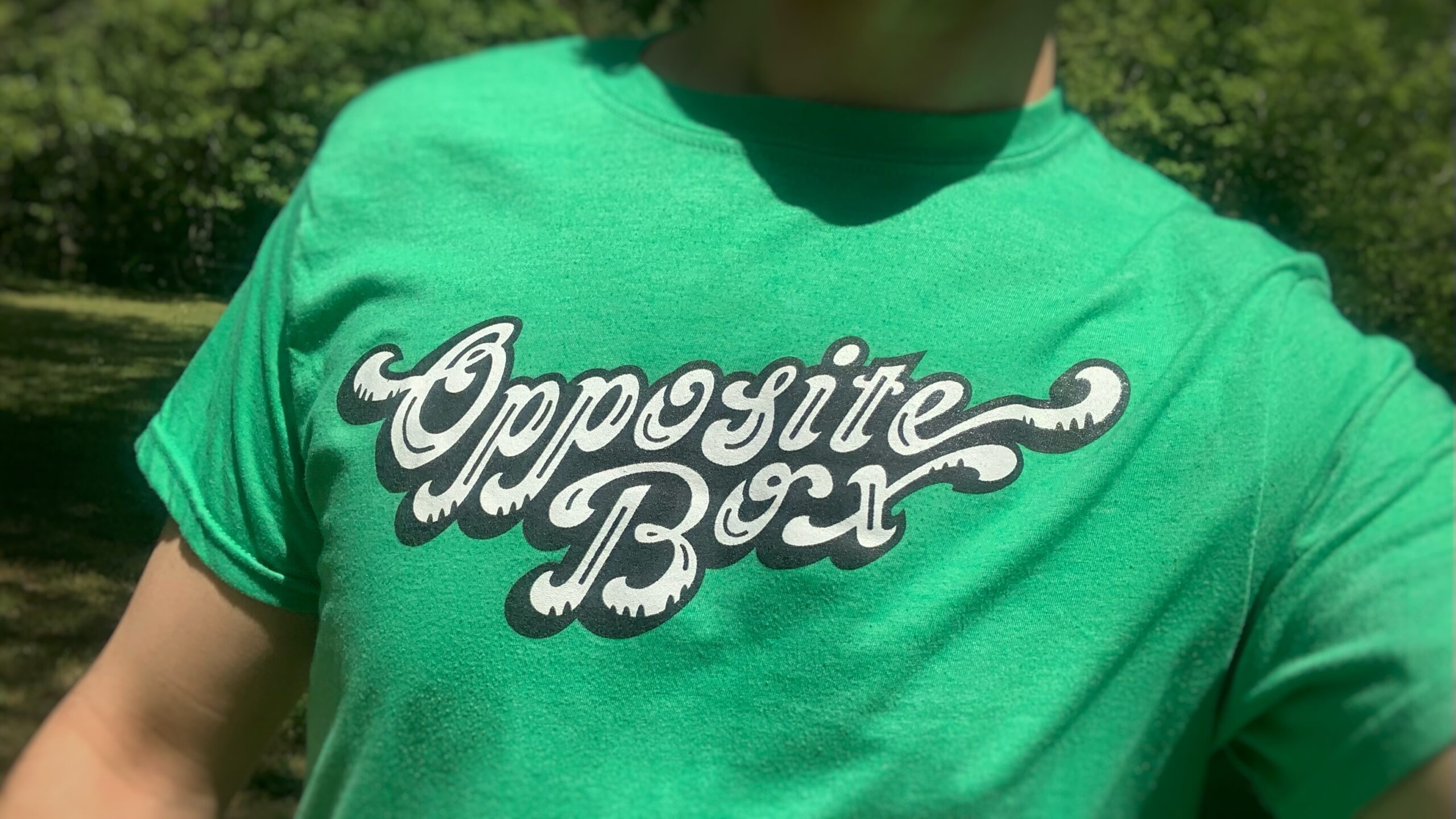
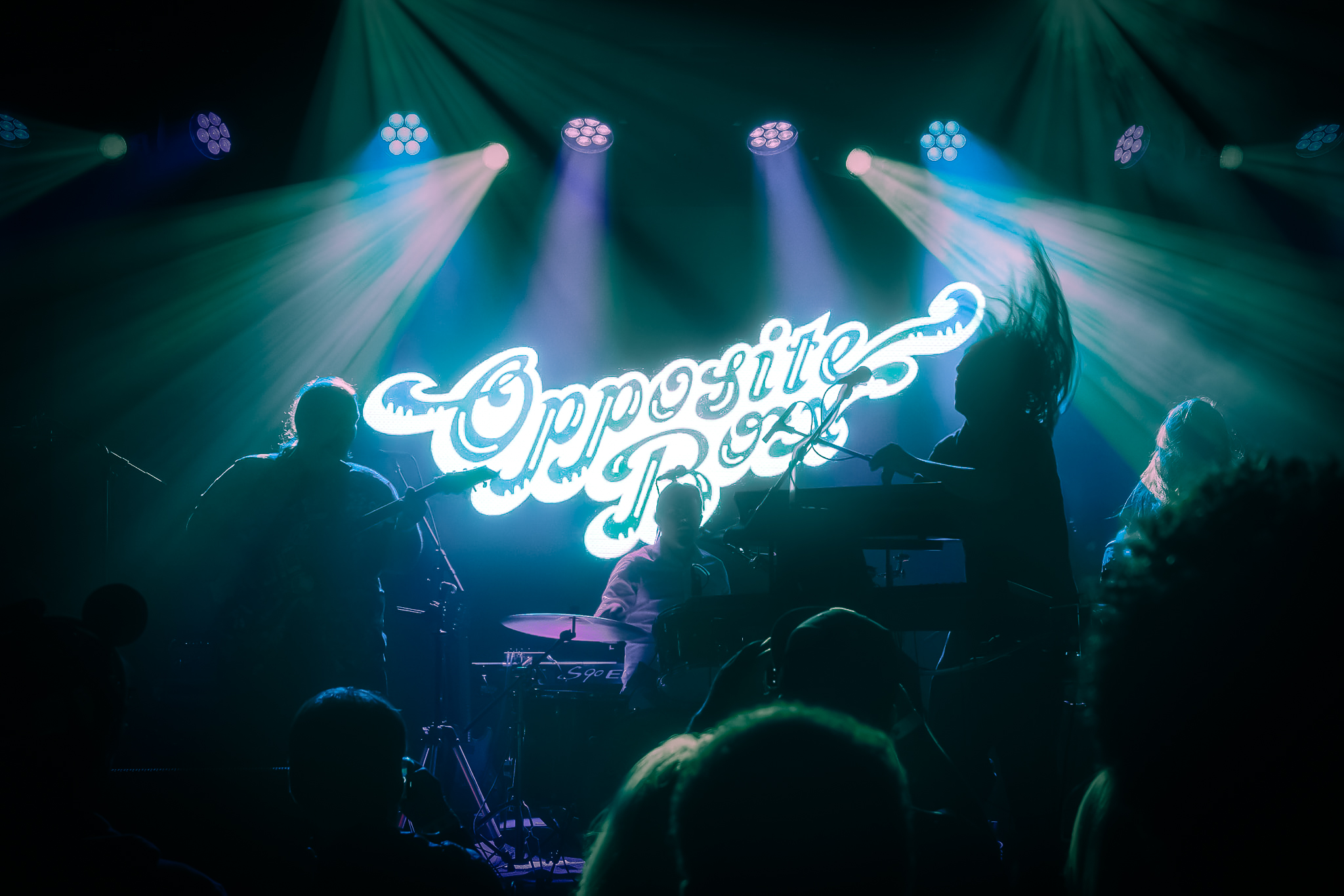
Opposite Box has often defined their sound as “Belligerent Jungle Funk.” Inspired by this term, I sought to combine 1970s typography with visual elements that indicate the natural world. The roundness and swooping curves of the letterforms can be found in animal tails, jungle vines, and palm fronds. The groupings of two and three indentations in the letterforms also suggest tiger stripes, claw marks, and the layout of black piano keys. This was intentional, because the electric keyboard/synthesizer is crucial to Opposite Box’s instrumentation, and central to their stage presence.
Full Name Logo
Initials Logo
“MONSTER MASH-UP” – POSTER

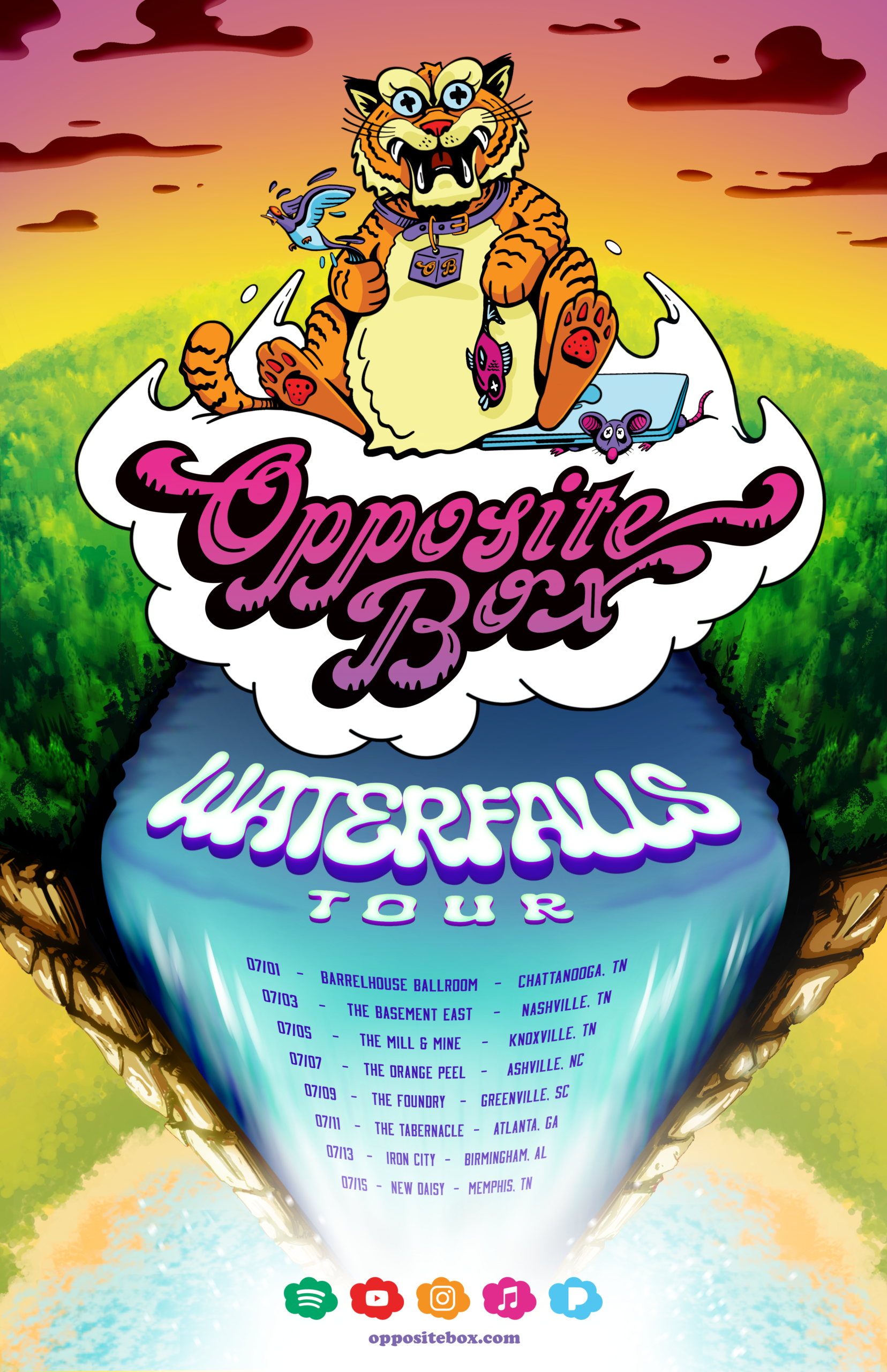
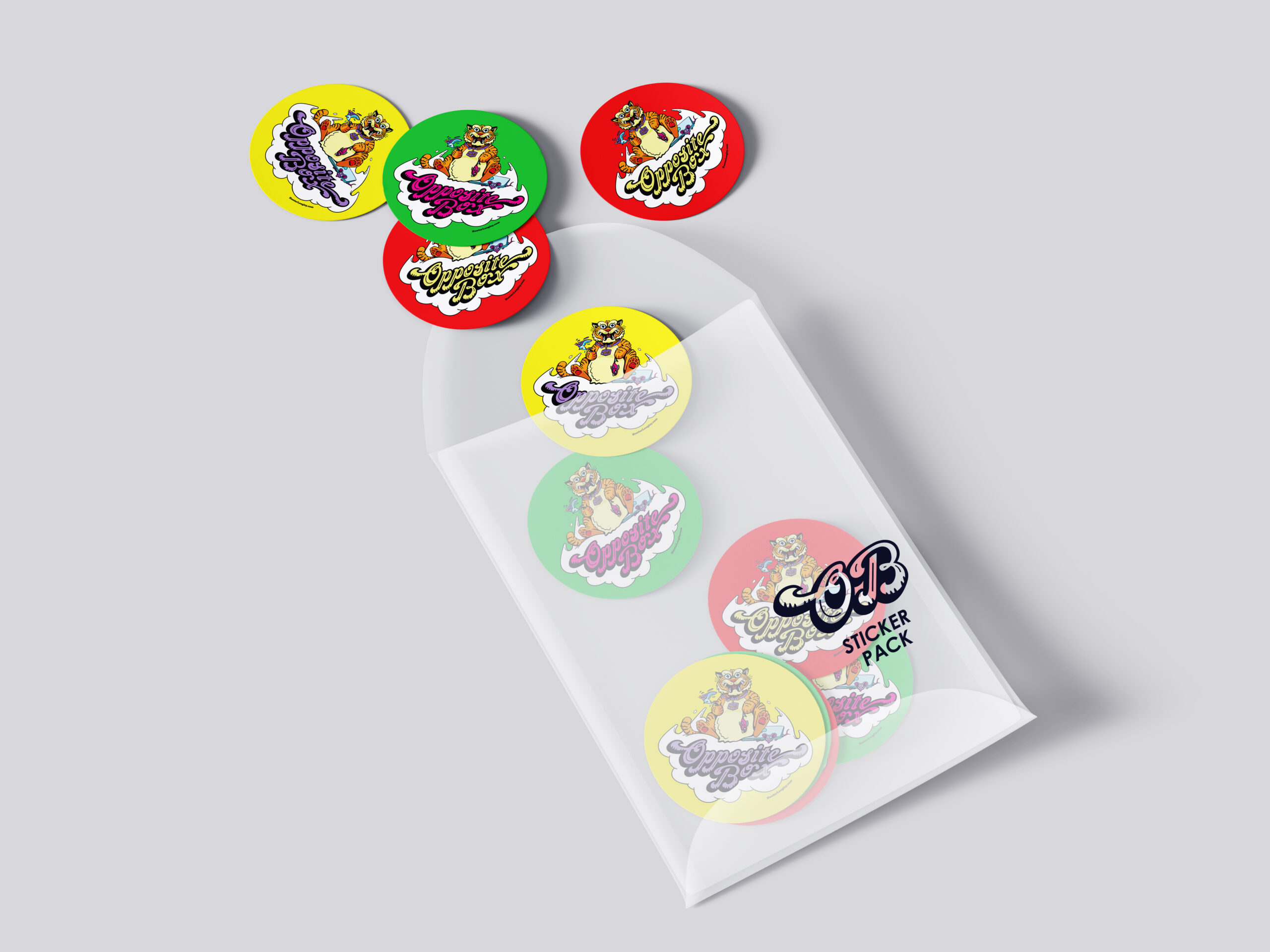
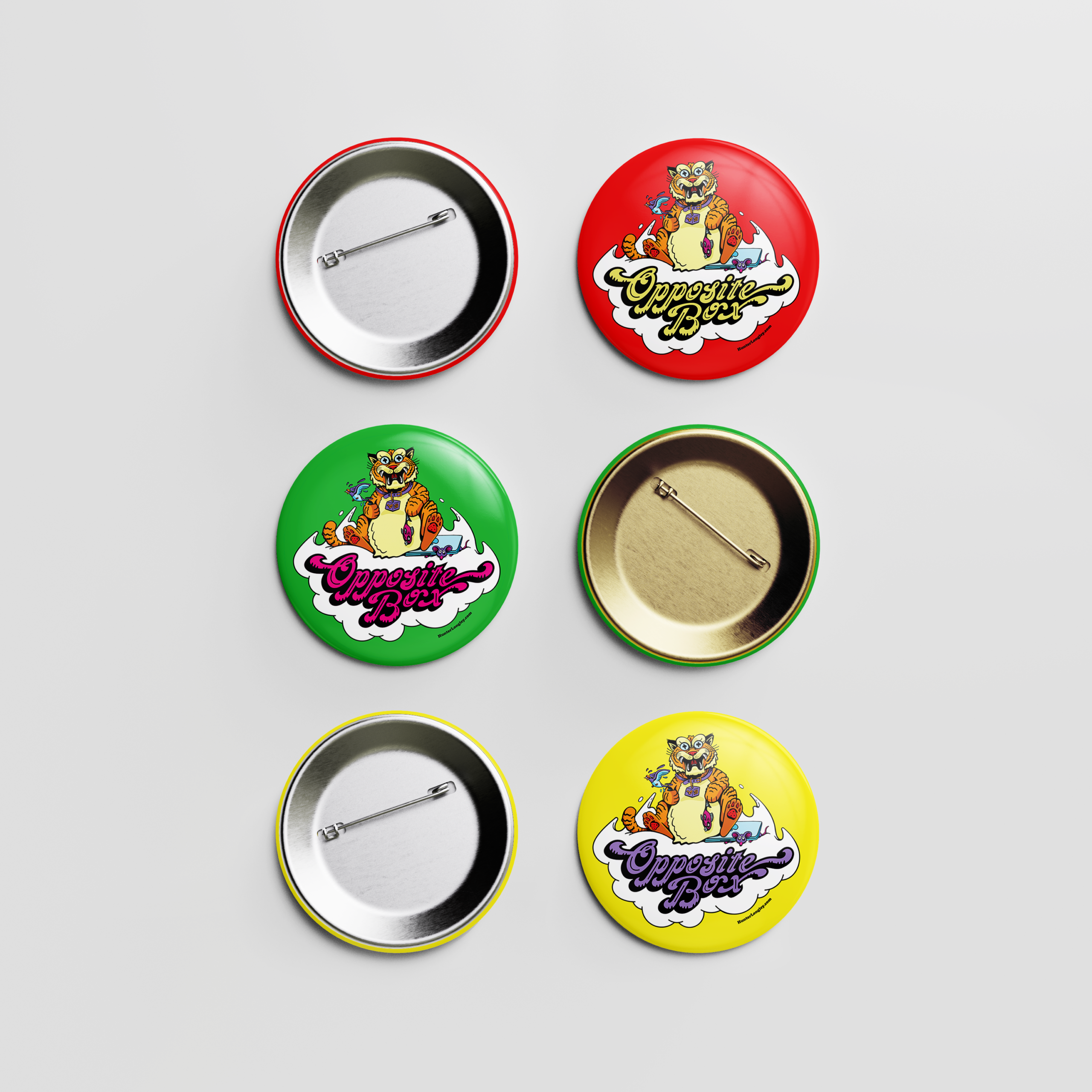
“WATERFALLS TOUR” – POSTER, STICKERS & PINS
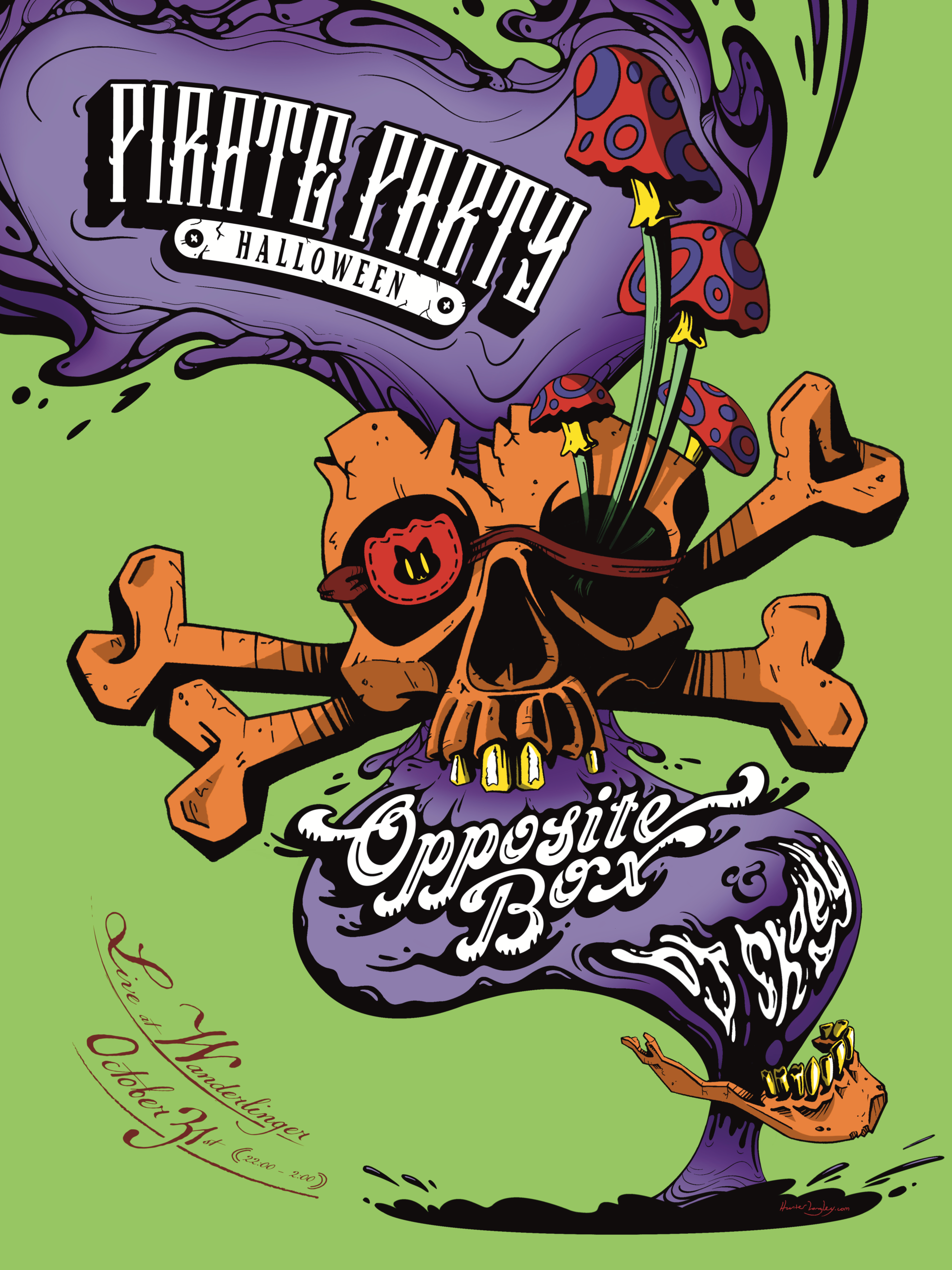
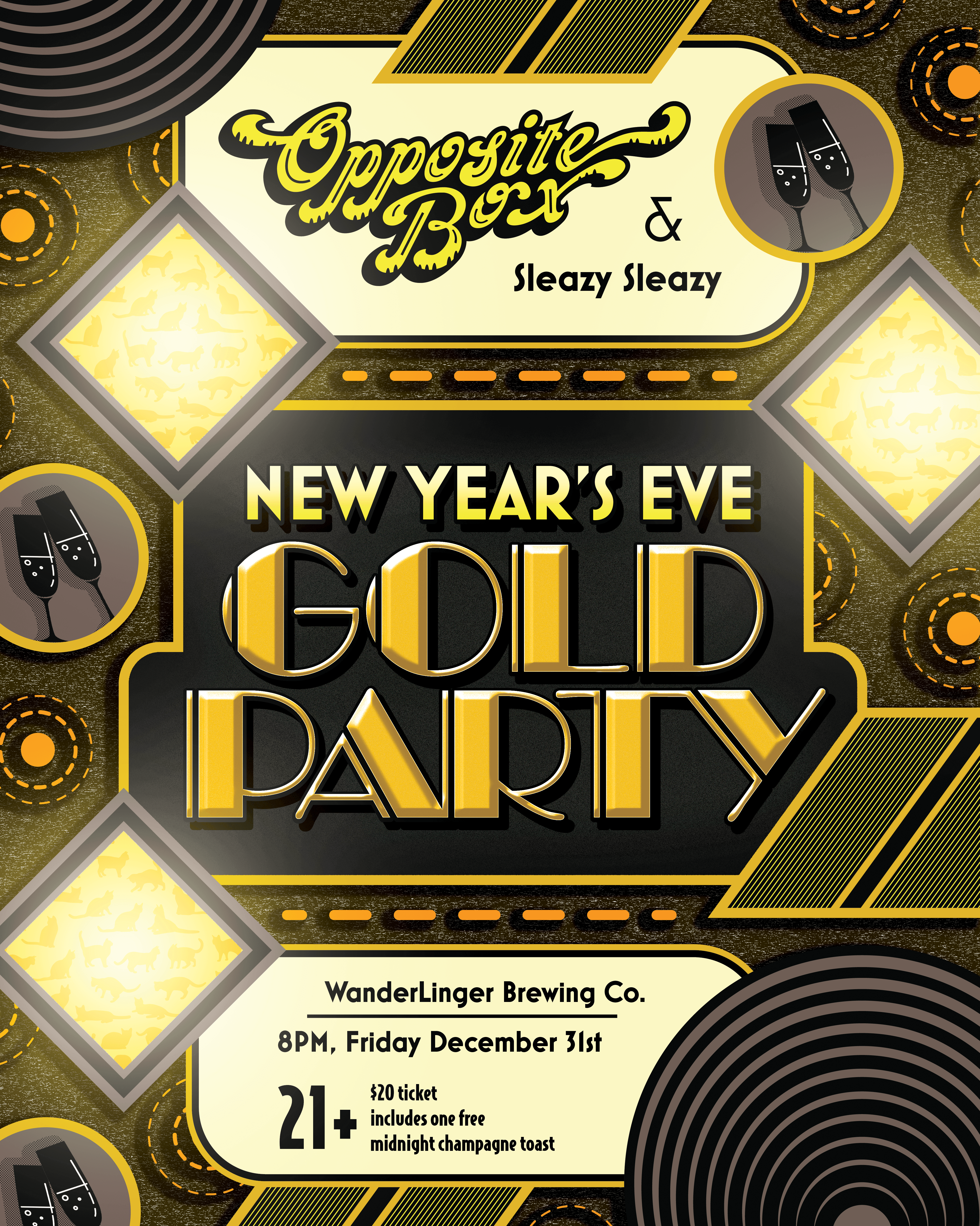
OTHER POSTERS

ALBUM – “A MULTITUDE OF COLOR”
Cover Artwork
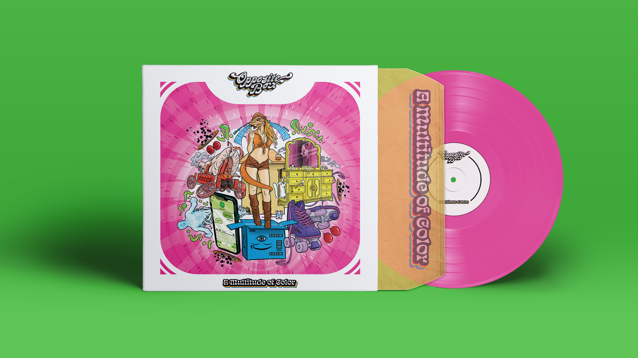

The concept behind Opposite Box’s album, “A Multitude of Color,” was for each of the six tracks to be represented by a specific ROYGBV color of the rainbow. Below you’ll see the individual tracklist illustrations I created. The cover artwork is a collage of these six images.
Tracklist Illustrations


SINGLE – “NO PLACE FOR PEOPLE LIKE US”
Opposite Box asked me to create a video of a flickering neon sign depicting the title of their 11 minute single, “No Place for People Like Us.” They also requested that that the lights change colors in accordance to the mood of the song. Later they made the sign’s dominant color scheme the official single artwork