KENDRICK LAMAR – DIGITAL PAINTING & ALTERNATIVE ALBUM PACKAGING
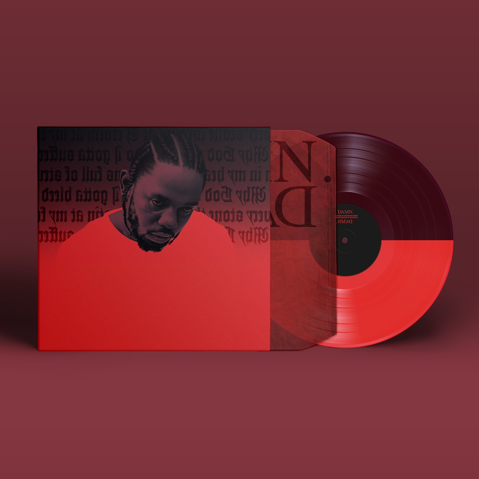

I began this piece in the spring of 2017, as a simple portrait study of Kendrick Lamar on the cover of his then new album, DAMN. I returned to finish the portrait in 2018, incorporating a year’s worth of thoughts on the music, and designing alternate album packaging around the portrait as well.
Frankly, I don’t know anyone for whom DAMN. is their favorite Kendrick album. Much of it feels incongruous: its lyrics are Kendrick’s most fanatically religious to date, yet its sound is his most radio-friendly. Its concept is his most ambiguous to date, yet its cover art is his most singularly iconic and meme-worthy. Additionally, the album’s world tour (The DAMN. Tour) displayed extensive Chinese influences in its design and promo materials, yet outside of Kendrick sometimes referring to himself as “Kung-Fu Kenny,” those influences never appear in the lyrical content, musical palette, or physical packaging of the album itself.
When DAMN. released on Good Friday of 2017, fans struggled to make sense of its incomplete nature. They started rumors suggesting Kendrick might drop a companion album at the end of the weekend — on Easter Sunday — and thus surprise the world with an expansive two-disc concept album paralleling Christ’s Resurrection. (The companion album was even presumed to be colored blue and called NATION., making the full project’s title DAMN.NATION.) This would have been cool, but unfortunately no companion album was ever released.
Failing that, and desperate to make sense of the album on its own merits, fans then began declaring DAMN. two albums in one; they alleged that a separate concept and storyline revealed itself when listening to the album in reverse song order. This theory eventually dominated so much press around DAMN. that a reversed version was officially released in December 2017. However, many fans (myself included) remain unconvinced that this was ever anything more than a marketing gimmick designed to appease fans still in denial… fans incapable of admitting that their favorite artist had released a dud.
I think of DAMN. for its year in pop culture more-so than its songs. I wanted my alternative album packaging to reflect all of its incompleteness, inconsistencies, and disappointments — while still embracing the iconic singularity of its original cover. I made it half light and half dark, half full and half empty: symbolic of the unsubstantiated double album rumors that have followed DAMN. since its release. To keep one half of the composition empty, I refrained from displaying the album title. To keep the other half of the composition full, I cluttered it with backwards lyrics, symbolic of DAMN.‘s “reversed version,” and the backwards vocals that appear in some songs. These lyrics are displayed in a blackletter typeface, loosely nodding to the album’s religious themes. My design also completely ignores the Chinese influences that felt so incongruous and inexplicable to the album’s original rollout. Ultimately, this piece may be viewed as alternative album packaging for DAMN., and as a critical review of the album through art.